Overview
Since its establishment in 2007, Digikala has been the leading eCommerce/marketplace in Iran. On its 10th anniversary, Digikala decided to perform a total renovation and revamp the whole business and its touchpoints – including the desktop and mobile websites. All departments, including product and design, started to revise their processes and experiences. For this matter, we defined a massive project to redesign the desktop and mobile web for Digikala.
As a junior UX designer at the time, I had a challenging yet great time contributing all my knowledge and academic experience to the team, the product, and the company.
Goal / Brief
On the first day of the project, the UX manager clarified the brief in a meeting:
We want to create a more desirable shopping experience for the customers within the new web platforms – desktop and mobile web. The redesigned experience must be fresh, yet familiar to the users, capable of the future features Digikala plans to provide.
It is noteworthy that SuperNova was a company-wide project, not only related to the design team.
Challenge
With SuperNova being a massive revamp project in every department of Digikala, dependencies on various epics in multiple departments were huge. It made us revise the design feature-wise several times, thus making the deadline even tighter for us.
Besides, being a junior designer at the time, I was the only UX designer working on this project, along with two of my UI designer colleagues, one for the desktop and the other for the mobile web experience. Later on, fortunately, I had the opportunity to benefit from some of my eagle-eyed UX designer colleagues to implement the final design touches and boost usability.
Unfortunately, not everything went as planned in the brief. That is because the brief itself changed multiple times – I know, that is not a good thing. It varied from pure UI facelift to redesigned experience considering both UX and UI. Despite all these comes and goes, we stood our ground about the importance of research, data, and UX in general, besides UI improvements. Considering the deadlines, that was a challenge for sure. But we made it happen.
Process
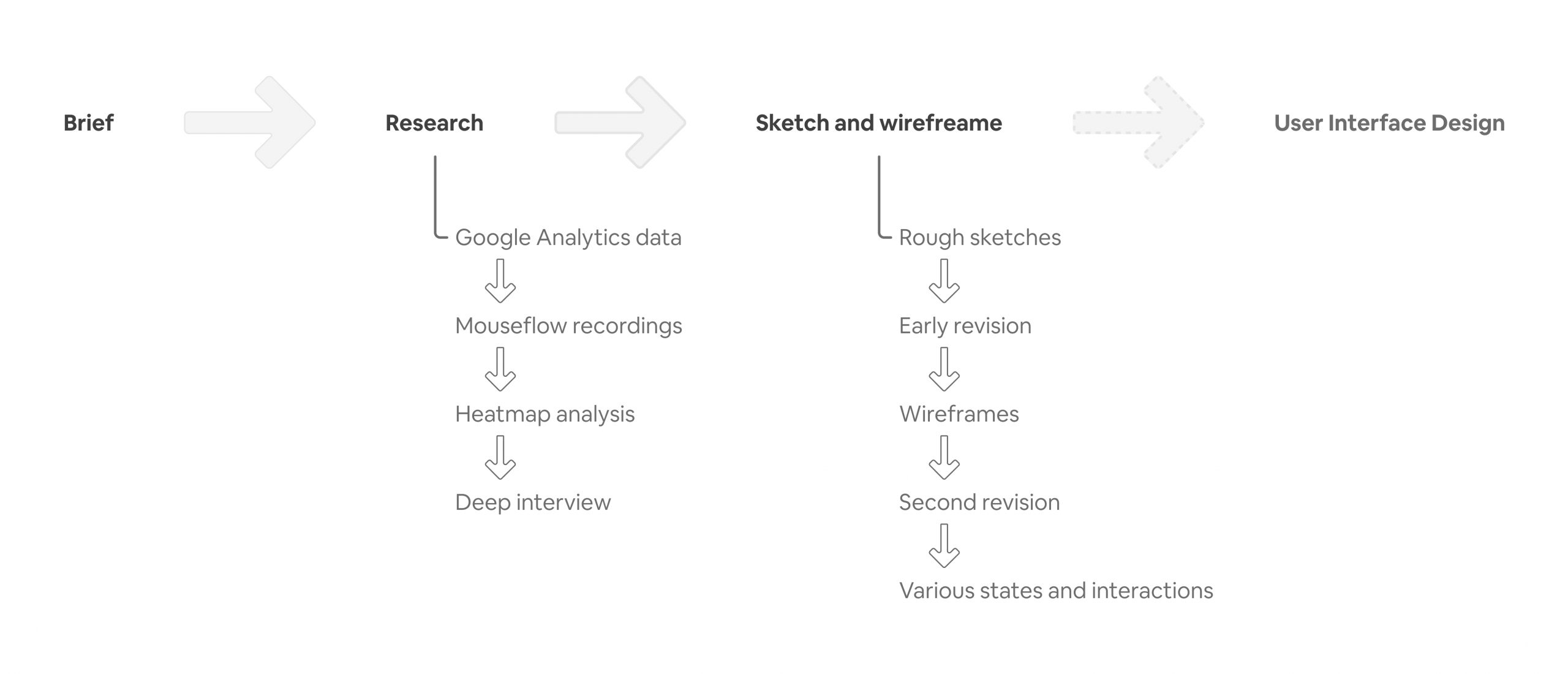
Research
Despite our tight deadline, research was not negligible. We decided to exploit all our online/offline resources and methods to collect insights about the current and potential future Digikala. At the time, Digikala was celebrating its 10th birthday. Given this and the fact that it has been the market leader in the past ten years, we had the merry of a massive user base whose behavior we have been tracking by Google Analytics, website heatmaps, recorded mouse flows, and call center issues. Besides, we had a Conversion Rate Optimization team. It had a test pool and results of these A/B or MVT tests. We even planned and started conducting deep interviews to know more about our users’ mindsets and intentions, but unfortunately, we could not make it due to the deadline we had to meet.
We observed and studied Google Analytics data, funnel, and user segments to find out more about the definite or potential pain points. Putting the data from Google Analytics next to mouse flow recordings and heatmaps provided us a holistic and detailed point of view about how users are doing what they do. We tried to figure out and validate our hypotheses about why they behave like this. We used our expert colleagues, call center fellows, and some small deep interviews for that matter. But honestly, we just went with the what and how and just some hypotheses about the why.
We had a lot of benchmarks. By benchmarking, we realized what is working and what is not. Sometimes we got inspired by non-eCommerce websites, and we could find our missing puzzle pieces on some sports websites.
At this point, I learned how to ask the right questions when dealing with data since one can easily get paralyzed by the enormous data he is facing.
Sketch and Wireframe
Here is where all our data would come into reality. As I mentioned earlier, at the beginning of the project, I was the only team member responsible for the UX design of SuperNova. It was a real challenge for me since I am a team worker. Fortunately, the UI designers were always helping hands in finding solutions, collaborating, and critiquing the solutions. After all, I was a single designer, and I did need someone to criticize my design and ask me the right questions to make my design solutions more solid well-grounded. And it worked! We had our challenges and debates before moving to the next phases – dealing with PMs, managers, C-levels, and the CEO himself. It was a great, bittersweet journey for me: it was a lot of pressure, but I learned a lot during this challenging time, and I could feel myself molting and leveling up.
About the process
Most of the time, I used to start with pen and paper. After ideations, I would transfer the sketches to the Sketch app so that I could groom them. Besides, talking and discussing were much easier and more right to the point when the wireframes were on the screen.
In this phase, usually, I would ask for the UI designers’ ideas about how the solution solves which problem(s) and how the UI would be according to the UX. We often had long discussions and iterations to get to the optimum point in the design.
The process went like this for some months. After that, the design team of SuperNova expanded, and every designer was responsible dedicatedly for some parts/flows of the website. We, together, groomed the design and checked for potential usability issues. Together, we managed to deliver the redesigned desktop and mobile web experiences of Digikala. I am glad that as a UX designer, I established a solid foundation to which my UX colleagues could contribute.
 Previous Project
Previous Project